/ How-To
By Colin on
Saturday, 24th November |
Comments Off on Less is More – The Perfect Layout

“I didn”t have time to write a short letter, so I wrote a long one instead.” – Mark Twain
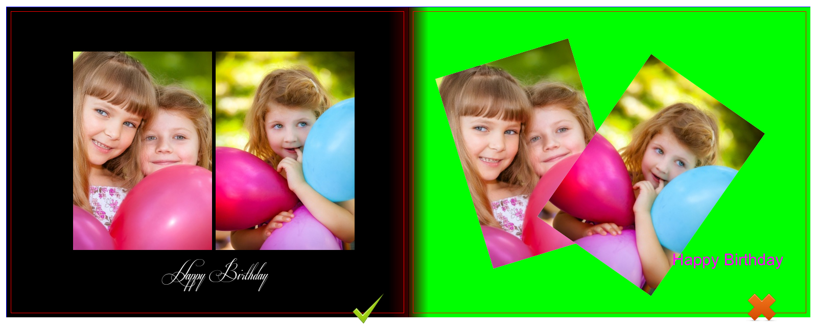
Designing a Photobook can be overwhelming because of all the options and features you are provided with. It is easy to get carried away and over design your Photobook project. Sometimes, it is best to take an editing eye and go for the Less is More approach with the design. After all, you want your Photobook to be a display of your images and memories. Here are a few helpful tips that will help you design with a Less is More attitude.
- Use a black or white solid colour backgrounds so that your photographs stand out on the page.
- Design with less photographs per page. This will give the viewer more time to look at and appreciate each photograph. This will also help the design not look overly cluttered.
- Display larger photographs on each page to make use of the page space the best. This will also show off your images better to the viewer.
- Don”t tilt your images, keep them on 90 degree angles for a more sophisticated and timeless feel.
- Keep your text in black or white for easy legibility depending on the background the text box is overlaying.
With that said, designing a Photobook is completely personal aesthetic and all of the design choices are up to you. There is no right or wrong way to design Photobooks, and that is one of the beauties of this craft.
Happy bookmaking!
SUBSCRIBE to us now and get a FREE 6" x 6" Mini Softcover Photobook (40 pages) or 4R Prints (100 Pcs)!
If you require further assistance, please contact our Support Team at support[at]photobookworldwide.com (Please replace the [at] with @)
